CSS3创建时尚且具有动画效果的进度条
作者:admin 时间:2020-7-10 15:33:36 浏览:我们看到各种各样的进度条,这些进度条显示了流程的当前完成状态,例如下载或文件传输。无论是在构建桌面应用程序还是在构建Web应用程序,都可能需要使用此UI元素。
在本文中,将介绍如何使用CSS3创建时尚且具有动画效果的进度条。
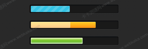
CSS3创建时尚且具有动画效果的进度条
进度条标记
标记很简单,代码如下:
<div class="progress-bar blue stripes">

    <span style="width: 40%"></span>

</div>
解释
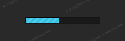
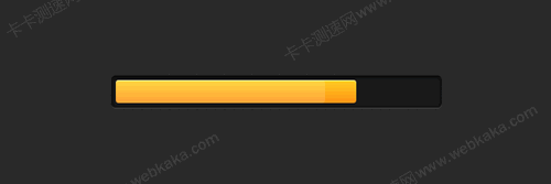
.progress-bar-定义进度条的常规样式。.blue-在这种情况下,.blueCSS类为进度栏添加了蓝色样式。.stripes-当前进度栏的动画类型。span-这将帮助您填充进度栏。内联集width将帮助您指定fill状态。
进度条CSS
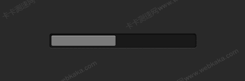
CSS3进度栏和填充区域的常规样式:
.progress-bar {
    background-color: #1a1a1a;
    height: 25px;
    padding: 5px;
    width: 350px;
    margin: 50px 0;
    border-radius: 5px;
    box-shadow: 0 1px 5px #000 inset, 0 1px 0 #444;
  }

  .progress-bar span {
    display: inline-block;
    height: 100%;
    border-radius: 3px;
    box-shadow: 0 1px 0 rgba(255, 255, 255, .5) inset;
    transition: width .4s ease-in-out;
} 
我们添加一些颜色和渐变:
.blue span {
background-color: #34c2e3;
}
.orange span {
background-color: #fecf23;
background-image: linear-gradient(top, #fecf23, #fd9215);
}
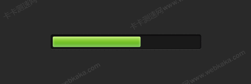
.green span {
background-color: #a5df41;
background-image: linear-gradient(top, #a5df41, #4ca916);
}CSS渐变条纹
.stripes span {
    background-size: 30px 30px;
    background-image: linear-gradient(135deg, rgba(255, 255, 255, .15) 25%,
                      transparent 25%,
                      transparent 50%, rgba(255, 255, 255, .15) 50%, rgba(255, 255, 255, .15) 75%,
                      transparent 75%, transparent);
    animation: animate-stripes 3s linear infinite;
  }

  @keyframes animate-stripes {
    0% {
      background-position: 0 0;
    }
    100% {
      background-position: 60px 0;
    }
  }
闪亮效果
.shine span {
    position: relative;
  }

  .shine span::after {
    content: '';
    opacity: 0;
    position: absolute;
    top: 0;
    right: 0;
    bottom: 0;
    left: 0;
    background: #fff;
    border-radius: 3px;
    animation: animate-shine 2s ease-out infinite;
  }

  @keyframes animate-shine {
    0% {
      opacity: 0;
      width: 0;
    }
    50% {
      opacity: .5;
    }
    100% {
      opacity: 0;
      width: 95%;
    }
  }
这个CSS3进度栏示例使用动画的CSS3 ::after 伪元素。
发光效果
基于box-shadow属性的CSS3关键帧动画:
.glow span {
  box-shadow: 0 5px 5px rgba(255, 255, 255, .7) inset,
              0 -5px 5px rgba(255, 255, 255, .7) inset;
  animation: animate-glow 1s ease-out infinite;
}

@keyframes animate-glow {
  0% {
    box-shadow: 0 5px 5px rgba(255, 255, 255, .7) inset,
                0 -5px 5px rgba(255, 255, 255, .7) inset;
  }
  50% {
    box-shadow: 0 5px 5px rgba(255, 255, 255, .3) inset,
                0 -5px 5px rgba(255, 255, 255, .3) inset;
  }
  100% {
    box-shadow: 0 5px 5px rgba(255, 255, 255, .7) inset,
                0 -5px 5px rgba(255, 255, 255, .7) inset;
  }
}
对于进一步的Web开发,要获得所需的结果,只需使用JavaScript或jQuery来更改这些进度条span的width值。
希望喜欢本教程。
相关文章
x


