纯css3实现漂亮的用户注册表单
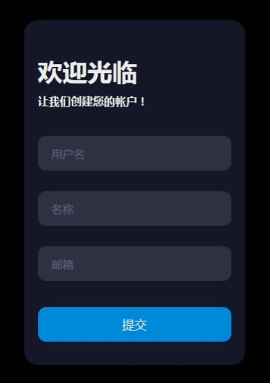
作者:admin 时间:2021-4-18 9:43:37 浏览:这个用户注册表单令人眼前一亮,它充分利用Placeholder的特点,当点击输入框的时候,提示文字移到输入框左上角,用户体验非常友好,值得推荐使用,这个漂亮的用户注册表单是用纯CSS3实现的。
纯css3实现漂亮的用户注册表单
CSS代码
body {
  align-items: center;
  background-color: #000;
  display: flex;
  justify-content: center;
  height: 100vh;
}

.form {
  background-color: #15172b;
  border-radius: 20px;
  box-sizing: border-box;
  height: 500px;
  padding: 20px;
  width: 320px;
}

.title {
  color: #eee;
  font-family: sans-serif;
  font-size: 36px;
  font-weight: 600;
  margin-top: 30px;
}

.subtitle {
  color: #eee;
  font-family: sans-serif;
  font-size: 16px;
  font-weight: 600;
  margin-top: 10px;
}

.input-container {
  height: 50px;
  position: relative;
  width: 100%;
}

.ic1 {
  margin-top: 40px;
}

.ic2 {
  margin-top: 30px;
}

.input {
  background-color: #303245;
  border-radius: 12px;
  border: 0;
  box-sizing: border-box;
  color: #eee;
  font-size: 18px;
  height: 100%;
  outline: 0;
  padding: 4px 20px 0;
  width: 100%;
}

.cut {
  background-color: #15172b;
  border-radius: 10px;
  height: 20px;
  left: 20px;
  position: absolute;
  top: -20px;
  transform: translateY(0);
  transition: transform 200ms;
  width: 76px;
}

.cut-short {
  width: 50px;
}

.input:focus ~ .cut,
.input:not(:placeholder-shown) ~ .cut {
  transform: translateY(8px);
}

.placeholder {
  color: #65657b;
  font-family: sans-serif;
  left: 20px;
  line-height: 14px;
  pointer-events: none;
  position: absolute;
  transform-origin: 0 50%;
  transition: transform 200ms, color 200ms;
  top: 20px;
}

.input:focus ~ .placeholder,
.input:not(:placeholder-shown) ~ .placeholder {
  transform: translateY(-30px) translateX(10px) scale(0.75);
}

.input:not(:placeholder-shown) ~ .placeholder {
  color: #808097;
}

.input:focus ~ .placeholder {
  color: #dc2f55;
}

.submit {
  background-color: #08d;
  border-radius: 12px;
  border: 0;
  box-sizing: border-box;
  color: #eee;
  cursor: pointer;
  font-size: 18px;
  height: 50px;
  margin-top: 38px;
  // outline: 0;
  text-align: center;
  width: 100%;
}

.submit:active {
  background-color: #06b;
}
HTML代码
<div class="form">

      <div class="title">欢迎光临</div>

      <div class="subtitle">让我们创建您的帐户!</div>

      <div class="input-container ic1">
        <input id="firstname" class="input" type="text" placeholder=" " />
        <div class="cut"></div>
        <label for="用户名" class="placeholder">用户名</label>
      </div>

      <div class="input-container ic2">
        <input id="lastname" class="input" type="text" placeholder=" " />
        <div class="cut"></div>
        <label for="名称" class="placeholder">名称</label>
      </div>

      <div class="input-container ic2">
        <input id="email" class="input" type="text" placeholder=" " />
        <div class="cut cut-short"></div>
        <label for="邮箱" class="placeholder">邮箱</label>
      </div>

      <button type="text" class="submit">提交</button>

</div>
代码解释
1、如下CSS代码比较不多见,是本表单的关键代码。
.input:focus ~ .cut,
.input:not(:placeholder-shown) ~ .cut {
  transform: translateY(8px);
}
.input:focus 表示获得焦点的输入字段。
兄弟选择器('~')表示在某元素之后的所有兄弟元素,不一定要紧跟在后面,但必须得是相同父元素,即必须是同一级元素。
.input:not(:placeholder-shown) ~ 表示标签选择器不适用于自动填充。
transform: translateY() Transform字面上就是变形,改变的意思。translateY(Y)仅垂直方向移动(Y轴移动)。
2、pointer-events: none; 属性
在CSS代码里,看到.placeholder的属性包含pointer-events: none; ,这里说说这个属性。
.placeholder {
  color: #65657b;
  font-family: sans-serif;
  left: 20px;
  line-height: 14px;
  pointer-events: none;
  position: absolute;
  transform-origin: 0 50%;
  transition: transform 200ms, color 200ms;
  top: 20px;
}这个pointer-events属性none值能阻止点击、状态变化和鼠标指针变化。
一些需要注意的关于pointer-events的事项:
- 子元素可以声明
pointer-events来解禁父元素的阻止鼠标事件限制。 - 如果你对一个元素设置了click事件监听器,然后你移除了
pointer-events样式声明,或把它的值改变为auto,监听器会重新生效。基本上,监听器会遵守pointer-events的设定。
pointer-events属性是用来禁止某元素的点击,这样的好处是样式上也得到了控制。当然,不要使用pointer-events来屏蔽一些十分关键的触发动作,因为这个样式可以通过浏览器控制台删除掉。
您可能对以下文章也感兴趣
标签: Placeholder 注册表单
相关文章
x


