详细介绍字体单位:em、ex、ch、rem等
作者:admin 时间:2024-8-16 9:32:52 浏览:字体单位是相对测量单位,是根据其他一些值计算的,可以动态变化。
与字体相关的测量单位有如下几个:
| 单位 | 描述 |
|---|---|
| em | 元素字体大小 |
| ex | 小写字母高度x |
| ch | 宽度0 |
| rem | 根元素字体大小 |
em
对于font-size这是继承的字体大小,对于其他属性,它是已经为 font-size 计算过的当前字体大小.。
为了查看这一点,让我们使用以下代码:
body {
 /* 基本字体大小 */
 字体大小:42px;
}

DIV {
 /* 继承父字体并缩小一半 */
 字体大小:.5em;
}

/* 每种情况下的边框有多厚? */
.box-1 {
 边框宽度:0.5em;
}
.box-2 {
 边框宽度:1em;
}
结果这样
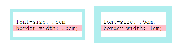
粉色条纹是高度为1em的渐变,以便可以进行比较。
两个块具有相同的字体大小,相对于父元素 (font-size: .5em; ) 缩小一半。
现在如何将框架厚度设置为等于字体大小?
border-width: .5em使框架比需要的薄两倍,这是因为父字体大小仅使用font-size,而border从font-size中获取计算值。
因此,如果某个地方当前字体大小不需要使用font-size,则不需要复制大小值,只需指定1em。右侧块具有正确厚度的框架。
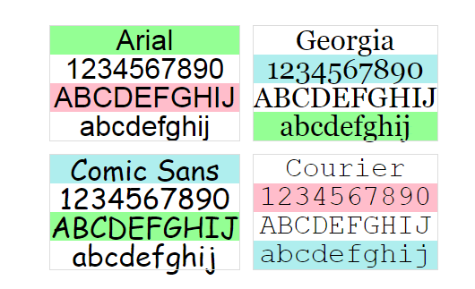
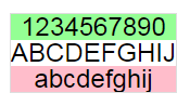
另一个了解em字体字符如何关联的演示。彩色条的高度为1em,因此可以看到它1em大致对应于字符的高度,考虑到大写字母和下降字母:
test.html
<!DOCTYPE html>
<html>
<head>
  <meta charset="UTF-8">
  <title>Gradients stripes with 1em height</title>
<style>
DIV {
  --stripe-height: 1em;
  background: linear-gradient(palegreen, palegreen var(--stripe-height), transparent 0, transparent calc(var(--stripe-height) * 2), pink 0, pink calc(var(--stripe-height) * 3), transparent 0, transparent calc(var(--stripe-height) * 4), paleturquoise 0, paleturquoise calc(var(--stripe-height) * 5), transparent 0, transparent calc(var(--stripe-height) * 6));
  background-size: 100% calc(var(--stripe-height) * 6);
  line-height: 1;
  font-size: 2rem;
  text-align: center;
  outline: 1px solid #DDD;
}
DIV:nth-child(2) {
  background-position: 0 calc(var(--stripe-height) * -3);
}
DIV:nth-child(3) {
  background-position: 0 calc(var(--stripe-height) * -4);
}
DIV:nth-child(4) {
  background-position: 0 calc(var(--stripe-height) * -1);
}

BODY {
  background: white;
  min-height: 100vh;
  display: grid;
  grid-template-columns: repeat(2, -webkit-max-content);
  grid-template-columns: repeat(2, max-content);
  align-items: center;
  align-content: center;
  justify-content: center;
  gap: 1rem;
}

.arial {
  font-family: Arial, sans-serif;
}

.courier {
  font-family: Courier New, monospace;
}

.georgia {
  font-family: georgia;
}

.comic-sans {
  font-family: Comic Sans MS;
}

P {
  margin: 0;
}
</style>
</head>

<body>
  <div class="arial">
  <p>Arial</p>
  <p>1234567890</p>
  <p>ABCDEFGHIJ</p>
  <p>abcdefghij</p>
</div>
<div class="georgia">
  <p>Georgia</p>
  <p>1234567890</p>
  <p>ABCDEFGHIJ</p>
  <p>abcdefghij</p>
</div>
<div class="comic-sans">
  <p>Comic Sans</p>
  <p>1234567890</p>
  <p>ABCDEFGHIJ</p>
  <p>abcdefghij</p>
</div>
<div class="courier">
  <p>Courier</p>
  <p>1234567890</p>
  <p>ABCDEFGHIJ</p>
  <p>abcdefghij</p>
</div>
</body>
</html>
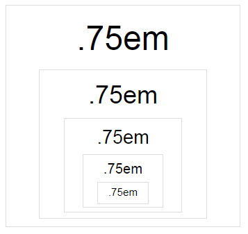
大小em在任何地方都不是固定的,是在使用时根据父字体大小计算的。例如,如果这样设置字体大小:
DIV {
  font-size: .75em;
}
然后将几个 div 嵌套在一起,下一个 div 的字体大小将小于前一个:
test.html
<!DOCTYPE html>
<html lang="en" >
<head>
<meta charset="UTF-8">
<title>Nested em</title>
<style>
DIV {
  font-size: 0.75em;
  padding: 0.25em 1em;
  line-height: 1.5;
  text-align: center;
  outline: 1px solid #DDD;
}
DIV > DIV {
  margin-top: 0.25em;
}

BODY {
  background: white;
  min-height: 100vh;
  display: grid;
  grid-template-columns: repeat(2, -webkit-min-content);
  grid-template-columns: repeat(2, min-content);
  align-items: center;
  align-content: center;
  justify-content: center;
  gap: 1rem;
  font-family: Arial, sans-serif;
  font-size: 4rem;
}
</style>
</head>
<body>
  <div>
  .75em
  <div>
    .75em
    <div>
      .75em
      <div>
        .75em
        <div>
          .75em
        </div>
      </div>
    </div>
  </div>
</div>
</body>
</html>
因为1em是当前继承的字体大小,并且.75em是继承字体缩小了四分之一。对于每个新的嵌套 div,首先继承父级的缩小字体,然后也以指定的方式缩小。
如果想指定em重用组件的大小,需要记住这一点:当元素相互嵌套时,计算出的em值可能不是你想要得到的值。
ex
ex-是小写字母x的高度。如果字体没有合适的度量,浏览器将尝试ex自行计算,如果由于某种原因不能这样计算,ex则认为等同于.5em。
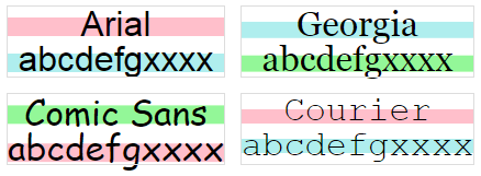
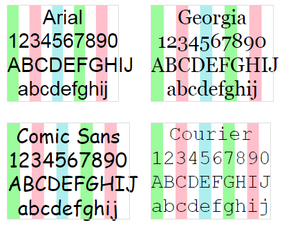
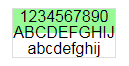
在下面演示中,颜色条的高度为1ex,对于所选字体,1ex将等于小x的高度:
test.html
<!DOCTYPE html>
<html>
<head>
  <meta charset="UTF-8">
  <title>Gradients stripes with 1ex height</title>
<style>
DIV {
  --stripe-height: 1ex;
  background: linear-gradient(palegreen, palegreen var(--stripe-height), transparent 0, transparent calc(var(--stripe-height) * 2), pink 0, pink calc(var(--stripe-height) * 3), transparent 0, transparent calc(var(--stripe-height) * 4), paleturquoise 0, paleturquoise calc(var(--stripe-height) * 5), transparent 0, transparent calc(var(--stripe-height) * 6));
  background-size: 100% calc(var(--stripe-height) * 6);
  line-height: 1;
  font-size: 2rem;
  text-align: center;
  outline: 1px solid #DDD;
}
DIV:nth-child(1) {
  background-position: 0 -1.4ex;
}
DIV:nth-child(2) {
  background-position: 0 -3.1ex;
}
DIV:nth-child(3) {
  background-position: 0 -5.4ex;
}
DIV:nth-child(4) {
  background-position: 0 -7ex;
}

BODY {
  background: white;
  min-height: 100vh;
  display: grid;
  grid-template-columns: repeat(2, -webkit-max-content);
  grid-template-columns: repeat(2, max-content);
  align-items: center;
  align-content: center;
  justify-content: center;
  gap: 1rem;
}

.arial {
  font-family: Arial, sans-serif;
}

.courier {
  font-family: Courier New, monospace;
}

.georgia {
  font-family: georgia;
}

.comic-sans {
  font-family: Comic Sans MS;
}

P {
  margin: 0;
}
</style>
</head>
<body>
  <div class="arial">
  <p>Arial</p>
  <p>abcdefgxxxx</p>
</div>
<div class="georgia">
  <p>Georgia</p>
  <p>abcdefgxxxx</p>
</div>
<div class="comic-sans">
  <p>Comic Sans</p>
  <p>abcdefgxxxx</p>
</div>
<div class="courier">
  <p>Courier</p>
  <p>abcdefgxxxx</p>
</div>
</body>
</html>
让我们看看ex字体如何影响它,以及ex与em有什么关系。
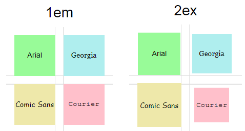
在此演示中,左侧组中的方块的大小为1em,右侧组中的方块的大小为2ex,因此你可以检查它们ex是否等于em的一半。此外,每个方块都有自己的字体:
test.html
<!DOCTYPE html>
<html>
<head>
  <meta charset="UTF-8">
  <title>1em vs 2ex</title>
<style>
.box--em .cell {
  width: 1em;
  height: 1em;
}
.box--ex .cell {
  width: 2ex;
  height: 2ex;
}

BODY {
  background: white;
  min-height: 100vh;
  display: grid;
  grid-template-columns: repeat(2, -webkit-max-content);
  grid-template-columns: repeat(2, max-content);
  align-items: center;
  justify-content: center;
  gap: 2rem;
  font-size: 80px;
  font-family: Arial, sans-serif;
}

.title {
  margin: 0;
  margin-bottom: 0.4em;
  font-size: 0.35em;
  text-align: center;
  font-weight: normal;
}

.cells {
  --gap: 1rem;
  display: grid;
  grid-template-columns: repeat(2, 1fr);
  gap: var(--gap);
  align-items: center;
  justify-content: center;
  justify-items: center;
  padding: var(--gap);
  background: linear-gradient(#DDD 1px, transparent 0, transparent var(--gap), #DDD calc(var(--gap) + 1px), #DDD calc(var(--gap) + 2px), transparent 0), linear-gradient(90deg, #DDD 1px, transparent 0, transparent var(--gap), #DDD calc(var(--gap) + 1px), #DDD calc(var(--gap) + 2px), transparent 0);
  background-position: center;
  background-size: 100% calc(var(--gap) + 2px), calc(var(--gap) + 2px) 100%;
  background-repeat: no-repeat;
}

.cell {
  display: flex;
  align-items: center;
  justify-content: center;
  text-align: center;
}
.cell::before {
  font-size: 0.18em;
}

.arial {
  background: palegreen;
  font-family: Arial, sans-serif;
}
.arial::before {
  content: "Arial";
  line-height: 1;
}

.courier {
  background: pink;
  font-family: Courier New, monospace;
}
.courier::before {
  content: "Courier";
}

.georgia {
  background: paleturquoise;
  font-family: Georgia;
}
.georgia::before {
  content: "Georgia";
}

.comic-sans {
  background: palegoldenrod;
  font-family: Comic Sans MS;
}
.comic-sans::before {
  content: "Comic Sans";
}
</style>
</head>
<body>
  <div class="box box--em">
  <h2 class="title">1em</h2>

  <div class="cells">
    <div class="cell arial"></div>
    <div class="cell georgia"></div>
    <div class="cell comic-sans"></div>
    <div class="cell courier"></div>
  </div>
</div>

<div class="box box--ex">
  <h2 class="title">2ex</h2>

  <div class="cells">
    <div class="cell arial"></div>
    <div class="cell georgia"></div>
    <div class="cell comic-sans"></div>
    <div class="cell courier"></div>
  </div>
</div>
</body>
</html>
与em不同的是,ex大小会随字体而变化,并且在所有情况下2ex都不等于1em,即不能依赖.5中的比例。
ex就像em,它继承父级的字体大小:
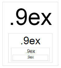
test.html
<!DOCTYPE html>
<html>
<head>
  <meta charset="UTF-8">
  <title>Nested ex</title>
<style>
DIV {
  font-size: 0.9ex;
  padding: 0 0.5ex 0.25ex;
  line-height: 1.3;
  text-align: center;
  outline: 1px solid #DDD;
}
DIV > DIV {
  margin-top: 0.25ex;
}

BODY {
  background: white;
  min-height: 100vh;
  display: grid;
  grid-template-columns: repeat(2, -webkit-min-content);
  grid-template-columns: repeat(2, min-content);
  align-items: center;
  align-content: center;
  justify-content: center;
  gap: 1rem;
  font-family: Arial, sans-serif;
  font-size: 10rem;
}
</style>
</head>
<body>
  <div>
  .9ex
  <div>
    .9ex
    <div>
      .9ex
      <div>
        .9ex
      </div>
    </div>
  </div>
</div>
</body>
</html>
ch
ch— 字符宽度0。对于等宽字体,这是任何字符的精确宽度;对于其他字体,这是一个窄字符的近似宽度。如果由于某种原因无法计算宽度,则后备值将为.5em。
警告不要尝试使用ch字符来设置容器的宽度,因为它不能按预期工作。在下面的演示中,每个文本块的宽度设置如下:
DIV {
  width: 10ch;
}
块宽度仅适用于等宽字体,在某些字体中它适用于数字(Arial, Comic Sans),在其他情况下不能期望它1ch等于字符宽度:
test.html
<!DOCTYPE html>
<html>
<head>
  <meta charset="UTF-8">
  <title>Unit ch</title>
<style>
DIV {
  width: 10ch;
  --stripe-width: 1ch;
  background: linear-gradient(90deg, palegreen, palegreen var(--stripe-width), transparent 0, transparent calc(var(--stripe-width) * 2), pink 0, pink calc(var(--stripe-width) * 3), transparent 0, transparent calc(var(--stripe-width) * 4), paleturquoise 0, paleturquoise calc(var(--stripe-width) * 5), transparent 0, transparent calc(var(--stripe-width) * 6));
  background-size: calc(var(--stripe-width) * 6) 100%;
  line-height: 1.2;
  font-size: 1.8rem;
  text-align: center;
  outline: 1px solid #DDD;
}
DIV:nth-child(1) {
  background-position: 0 -1.4ex;
}
DIV:nth-child(2) {
  background-position: 0 -3.1ex;
}
DIV:nth-child(3) {
  background-position: 0 -5.4ex;
}
DIV:nth-child(4) {
  background-position: 0 -7ex;
}

BODY {
  background: white;
  min-height: 100vh;
  display: grid;
  grid-template-columns: repeat(2, -webkit-max-content);
  grid-template-columns: repeat(2, max-content);
  align-items: center;
  align-content: center;
  justify-content: center;
  gap: 2rem;
}

.arial {
  font-family: Arial, sans-serif;
}

.courier {
  font-family: Courier New, monospace;
}

.georgia {
  font-family: georgia;
}

.comic-sans {
  font-family: Comic Sans MS;
}

P {
  margin: 0;
}
</style>
</head>
<body>
  <div class="arial">
  <p>Arial</p>
  <p>1234567890</p>
  <p>ABCDEFGHIJ</p>
  <p>abcdefghij</p>
</div>
<div class="georgia">
  <p>Georgia</p>
  <p>1234567890</p>
  <p>ABCDEFGHIJ</p>
  <p>abcdefghij</p>
</div>
<div class="comic-sans">
  <p>Comic Sans</p>
  <p>1234567890</p>
  <p>ABCDEFGHIJ</p>
  <p>abcdefghij</p>
</div>
<div class="courier">
  <p>Courier</p>
  <p>1234567890</p>
  <p>ABCDEFGHIJ</p>
  <p>abcdefghij</p>
</div>
</body>
</html>
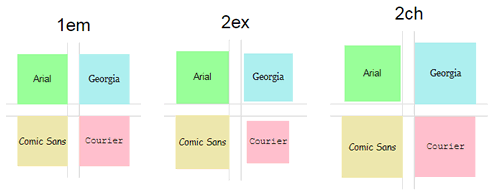
我们来比较1em、2ex和2ch:
test.html
<!DOCTYPE html>
<html>
<head>
  <meta charset="UTF-8">
  <title>1em vs 2ex vs 2ch</title>
<style>
.box--em .cell {
  width: 1em;
  height: 1em;
}
.box--ex .cell {
  width: 2ex;
  height: 2ex;
}
.box--ch .cell {
  width: 2ch;
  height: 2ch;
}

BODY {
  background: white;
  min-height: 100vh;
  display: grid;
  grid-template-columns: repeat(3, -webkit-max-content);
  grid-template-columns: repeat(3, max-content);
  align-items: center;
  justify-content: center;
  gap: 2rem;
  font-size: 70px;
  font-family: Arial, sans-serif;
}

.title {
  margin: 0;
  margin-bottom: 0.4em;
  font-size: 0.35em;
  text-align: center;
  font-weight: normal;
}

.cells {
  --gap: 1rem;
  display: grid;
  grid-template-columns: repeat(2, 1fr);
  gap: var(--gap);
  align-items: center;
  justify-content: center;
  justify-items: center;
  padding: var(--gap);
  background: linear-gradient(#DDD 1px, transparent 0, transparent var(--gap), #DDD calc(var(--gap) + 1px), #DDD calc(var(--gap) + 2px), transparent 0), linear-gradient(90deg, #DDD 1px, transparent 0, transparent var(--gap), #DDD calc(var(--gap) + 1px), #DDD calc(var(--gap) + 2px), transparent 0);
  background-position: center;
  background-size: 100% calc(var(--gap) + 2px), calc(var(--gap) + 2px) 100%;
  background-repeat: no-repeat;
}

.cell {
  display: flex;
  align-items: center;
  justify-content: center;
  text-align: center;
}
.cell::before {
  font-size: 0.18em;
}

.arial {
  background: palegreen;
  font-family: Arial, sans-serif;
}
.arial::before {
  content: "Arial";
  line-height: 1;
}

.courier {
  background: pink;
  font-family: Courier New, monospace;
}
.courier::before {
  content: "Courier";
}

.georgia {
  background: paleturquoise;
  font-family: Georgia;
}
.georgia::before {
  content: "Georgia";
}

.comic-sans {
  background: palegoldenrod;
  font-family: Comic Sans MS;
}
.comic-sans::before {
  content: "Comic Sans";
}
</style>
</head>

<body>
  <div class="box box--em">
  <h2 class="title">1em</h2>

  <div class="cells">
    <div class="cell arial"></div>
    <div class="cell georgia"></div>
    <div class="cell comic-sans"></div>
    <div class="cell courier"></div>
  </div>
</div>

<div class="box box--ex">
  <h2 class="title">2ex</h2>

  <div class="cells">
    <div class="cell arial"></div>
    <div class="cell georgia"></div>
    <div class="cell comic-sans"></div>
    <div class="cell courier"></div>
  </div>
</div>

<div class="box box--ch">
  <h2 class="title">2ch</h2>

  <div class="cells">
    <div class="cell arial"></div>
    <div class="cell georgia"></div>
    <div class="cell comic-sans"></div>
    <div class="cell courier"></div>
  </div>
</div>
</body>
</html>
显然:
1ch更大1ex(宽度0大于高度x);1ch不等于em一半;ch可能会随字体而变化。
rem
rem是root em根元素的字体大小;对于网页来说,这是 element html。默认字体大小为16px,该值在规范中并不固定,但被所有浏览器使用。
如果用户在浏览器设置中设置不同的值,它将覆盖根元素的字体大小。也就是说,如果你需要制作一个会缩放到用户选择的字体大小的界面,那么使用rem。
重要的是要了解rem大小只能针对html,例如,采用以下样式:
BODY {
  font-size: 24px;
}

DIV {
  font-size: 1rem;
}如果rem可以覆盖任何地方,文本就会增加,但这并没有发生:
test.html
<!DOCTYPE html>
<html>
<head>
  <meta charset="UTF-8">
  <title>Try to override rem in body</title>
<style>
HTML {
  font-size: 16px;
}

BODY {
  font-size: 24px;
}

DIV {
  font-size: 1rem;
}

BODY {
  background: white;
  min-height: 100vh;
  display: grid;
  align-items: center;
  justify-content: center;
  font-family: Arial, sans-serif;
}

P {
  margin: 0;
  text-align: center;
}

DIV {
  --stripe-height: 24px;
  background: linear-gradient(palegreen, palegreen var(--stripe-height), transparent 0, transparent calc(var(--stripe-height) * 2), pink 0, pink calc(var(--stripe-height) * 3), transparent 0, transparent calc(var(--stripe-height) * 4), paleturquoise 0, paleturquoise calc(var(--stripe-height) * 5), transparent 0, transparent calc(var(--stripe-height) * 6));
  background-size: 100% calc(var(--stripe-height) * 6);
  line-height: 1;
  outline: 1px solid #DDD;
}
</style>

</head>
<body>
  <div>
  <p>1234567890</p>
  <p>ABCDEFGHIJ</p>
  <p>abcdefghij</p>
</div>

</body>
</html>
颜色条的高度24px,以便有东西可以比较。
如果覆盖元素html的字体大小,一切都会正常:
HTML {
  font-size: 24px;
}

DIV {
  font-size: 1rem;
} 
test.html
<!DOCTYPE html>
<html>
<head>
  <meta charset="UTF-8">
  <title>Change html font-size</title>
<style>
HTML {
  font-size: 24px;
}

DIV {
  font-size: 1rem;
}

BODY {
  background: white;
  min-height: 100vh;
  display: grid;
  align-items: center;
  justify-content: center;
  font-family: Arial, sans-serif;
}

DIV {
  --stripe-height: 24px;
  background: linear-gradient(palegreen, palegreen var(--stripe-height), transparent 0, transparent calc(var(--stripe-height) * 2), pink 0, pink calc(var(--stripe-height) * 3), transparent 0, transparent calc(var(--stripe-height) * 4), paleturquoise 0, paleturquoise calc(var(--stripe-height) * 5), transparent 0, transparent calc(var(--stripe-height) * 6));
  background-size: 100% calc(var(--stripe-height) * 6);
  line-height: 1;
  outline: 1px solid #DDD;
}

P {
  margin: 0;
  text-align: center;
}
</style>

</head>
<body>
  <div>
  <p>1234567890</p>
  <p>ABCDEFGHIJ</p>
  <p>abcdefghij</p>
</div>
</body>
</html>
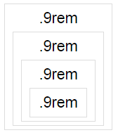
与em不同的是,rem它始终仅包含根元素的字体大小,因此嵌套不会影响任何内容:
test.html
<!DOCTYPE html>
<html>
<head>
  <meta charset="UTF-8">
  <title>Nested rem</title>
<style>
HTML {
  font-size: 24px;
}

DIV {
  font-size: 0.9rem;
  padding: 0.25rem 0.5rem;
  line-height: 1.3;
  text-align: center;
  outline: 1px solid #DDD;
}
DIV > DIV {
  margin-top: 0.25rem;
}

BODY {
  background: white;
  min-height: 100vh;
  display: grid;
  grid-template-columns: repeat(2, -webkit-min-content);
  grid-template-columns: repeat(2, min-content);
  align-items: center;
  align-content: center;
  justify-content: center;
  gap: 1rem;
  font-family: Arial, sans-serif;
  font-size: 10rem;
}
</style>
</head>
<body>
  <div>
  .9rem
  <div>
    .9rem
    <div>
      .9rem
      <div>
        .9rem
      </div>
    </div>
  </div>
</div>
</body>
</html>
这允许你制作尺寸与基本字体大小相关的组件,但不依赖于彼此之间的元素嵌套。
总结
本文详细介绍字体单位:em、ex、ch、rem等,通过本文的学习,你应该对字体单位有了更加充分的了解。


